Results That Resonate
Proven Success Across IndustriesOur Work Showcase
Explore our portfolio to see the diverse projects we’ve successfully completed. From revitalizing brand identities to launching comprehensive digital marketing campaigns, our work spans multiple industries and showcases our ability to deliver customized, measurable marketing results.
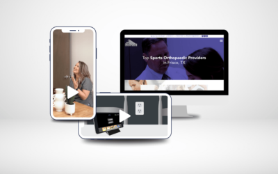
Medical Marketing with Strategic Digital Solutions
The medical industry requires comprehensive and tailored digital marketing solutions. See how Frozen Fire can help you.
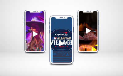
Capturing Unforgettable Moments: Event and Conference Videography and Photography
Make your event unforgettable with high-quality conference videography. Learn more about how Frozen Fire brings events to life through dynamic videography and photography.
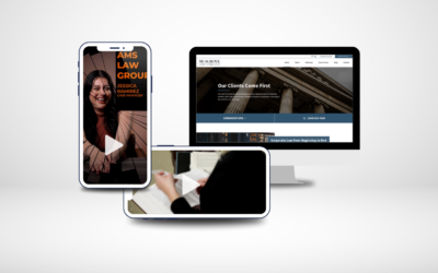
Elevate Your Law Firm’s Digital Presence
Elevate your law firm’s digital marketing with tailored strategies. Our solutions enhance visibility and enhance trust.
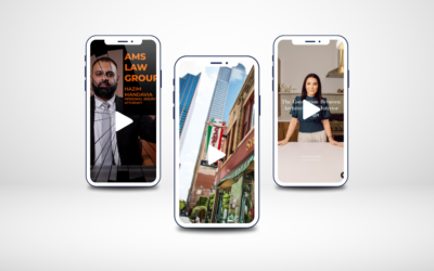
Vertical Video Production: Boost Engagement and Drive Results
Discover how vertical video production captures attention and drives engagement. Our strategic approach helps brands stand out and connect.


